June 1, 2025

June 1, 2025

Recipe App – Case Study

Recipe App – Case Study

Recipe App – Case Study

A hands-on test to show how I approach product design — done as part of an application for a role at an international company.

A hands-on test to show how I approach product design — done as part of an application for a role at an international company.

A hands-on test to show how I approach product design — done as part of an application for a role at an international company.

Riders
Riders
Riders

Year

2025

Client

Stealth Company

Category

App Design

Product Duration

1 Week
1. THE PROBLEM
1. THE PROBLEM
1. THE PROBLEM

Too many recipes. Not enough help.


Most recipe apps bombard you with endless lists, filters, and categories. But when you're hungry, tired, and staring into a sad fridge, you don't want 300 ideas — you want one thing you can cook now. Most platforms start with a recipe-first approach: "What do you want to make?" — but users often don’t know. They just want to use up what’s in their kitchen.


Cooking isn’t about endless options. It’s about starting with what you already have.

2. RESEARCH & VALIDATION

I didn’t do user interviews. I explored like a hungry person would.


I analyzed dozens of food apps to see what they offer vs. what they miss. I dove into Reddit threads, Indie Hackers posts, and App Store reviews to find out what real users complain about — and what they wish existed. I also simulated first-time user flows with AI to evaluate clarity and friction.


What I found:


  • Many apps allow recipe browsing, but very few let you start by entering your ingredients.


  • When ingredient input is offered, it often leads to irrelevant suggestions, or recipes that still require multiple missing items.


  • Filters tend to be over-complicated and require a lot of tweaking before you get useful results.


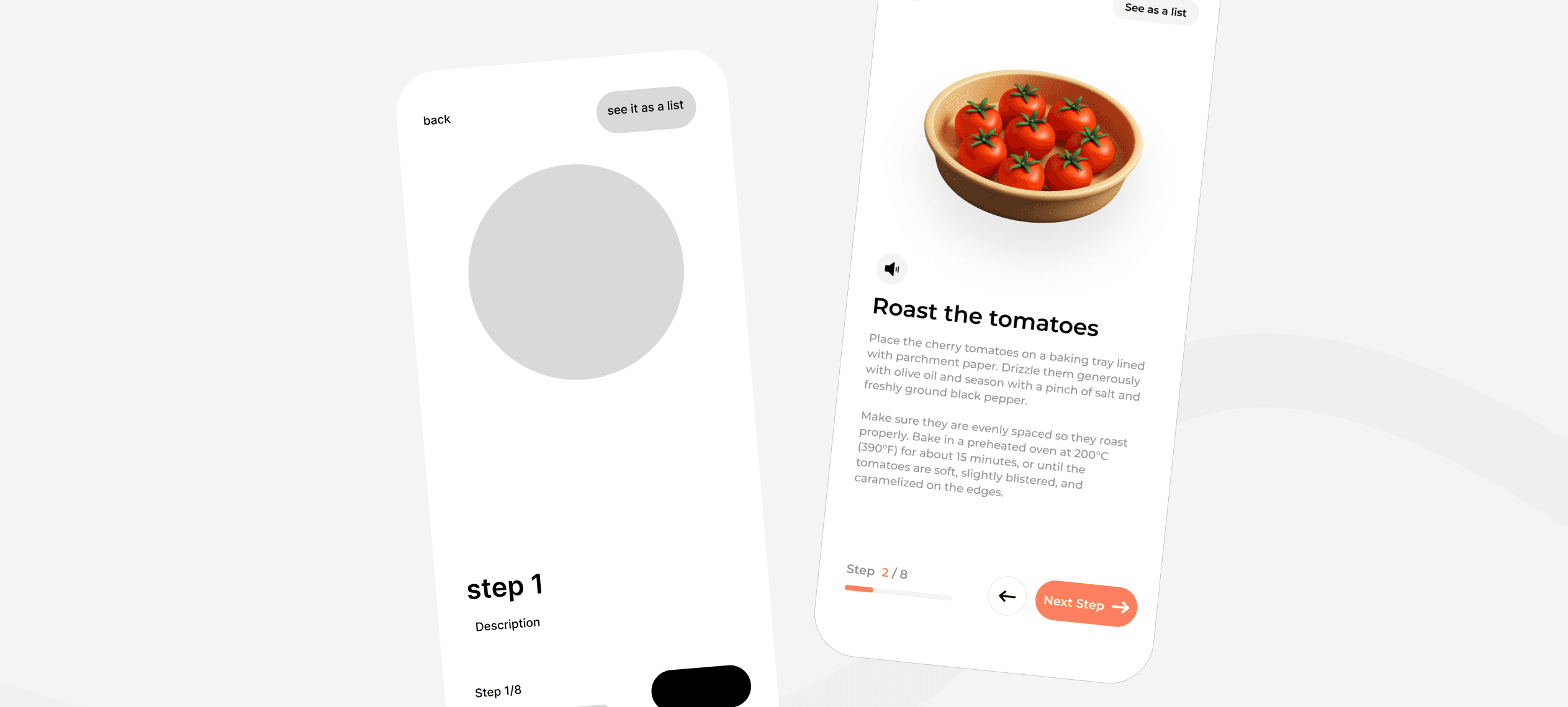
  • There’s rarely a true "cooking mode". You're left with walls of text or blog-style recipe pages.


  • Once a recipe is selected, there's no structured experience for following the steps. No progression. No voice. No visual clarity.


Real complaints I gathered:


  • "Why ask me what ingredients I have if you ignore them?"

  • "Scrolling while cooking is the worst UX ever."

  • "Too many steps just to see a recipe."


These gaps became the pillars of my direction. I wasn’t designing another Pinterest for food. I was designing a cooking assistant.

3. USER PERSONA
3. USER PERSONA
3. USER PERSONA

Meet Laura: full-time worker, part-time home chef.


  • 29 years old

  • Lives in a shared flat

  • Cooks a few times a week

  • Doesn’t meal plan, just opens the fridge and hopes for inspiration

  • Wants to avoid waste but hates overthinking dinner


She uses Pinterest and Instagram for food ideas, but often gets overwhelmed or forgets the recipes. She doesn’t have time to fill out long onboarding flows. She needs speed, simplicity, and confidence.

Laura doesn't want to be a chef. She just wants dinner without stress.

4. THE OPPORTUNITY
4. THE OPPORTUNITY
4. THE OPPORTUNITY

Flip the experience: start with ingredients, not recipes.


While most apps ask you what you want to cook, I flipped the approach. What if the app simply asked:

"What do you have right now?"


From that input, it could deliver realistic recipes, with smart filters based on meal type, time, difficulty, and dietary tags — all while staying visual and lightweight. The goal: minimize decisions and maximize action.

I also wanted to add a "scan your fridge" feature to give the user a sense of magic, even if it’s just a clever shortcut.

5. THE SOLUTION
5. THE SOLUTION
5. THE SOLUTION

Simple Recipe App: The chill, visual way to cook smarter.


The app lets you:

  • Browse by meal type if you're feeling curious

  • Add ingredients manually (using pill tags by category)

  • Or scan your fridge with the camera for quick input

  • See a filtered, curated list of recipes that actually match what you have

  • Follow the cooking steps in a focused, swipe-based cooking mode


Each screen is clean, single-purpose, and built for real-world kitchen chaos.

6. USER FLOW
6. USER FLOW
6. USER FLOW

Scan → Pick → Cook. That’s it.


Here’s how the user journey works:


  1. Home / Discovery
    Scroll through curated lists by meal type, or tap the CTA: "Use your ingredients".


  2. Ingredient Picker
    Select ingredients manually with visual chips, or use the camera to scan your fridge. Items are grouped (e.g., Veggies, Dairy, Protein).


  3. Scan Wait State
    A friendly loading screen with a message: "This won’t take more than 30 seconds." Feedback and cancel options included.


  4. Recipe Results
    Cards show the image, name, tags (e.g., Vegan, Spicy), time, difficulty, and calories.


  5. Recipe Detail
    Overview of ingredients, cooking time, and button to start cooking mode.


  6. Cooking Mode
    One step per screen, with illustration, short text, audio option, and a progress bar.


Of course there are more functionalities and screens, but I guess you don't want to spend 4 hours reading this :)

7. WIREFRAMES
7. WIREFRAMES
7. WIREFRAMES

Sketch first. Keep it tight.


Low-fi wireframes helped me:


  • Prioritize flow clarity

  • Define key interactions (scan, add ingredient, swipe)

  • Visualize how much info should be on each step

  • Decide early what not to include


Everything was built mobile-first with chunky tappable areas, minimal navigation, and clear CTAs.

Before after gris
Before after gris
Before after gris
before after tronja
before after tronja
before after tronja
8. FINAL UI
8. FINAL UI
8. FINAL UI

Calm, bold, and made for messy hands.


  • White background for space and calm

  • Bold orange as the only accent (used only for actions)

  • Soft illustrations for each cooking step

  • Pill-style ingredients for quick scanning

  • Minimal microcopy that’s friendly but not cheesy ("Okay chef, what’s in the fridge?")

  • Progress indicators and voice options during cook mode


This wasn’t just about aesthetics. Every detail was designed to support focus, simplicity, and momentum

9. REFLECTION
9. REFLECTION
9. REFLECTION

This app isn’t trying to be everything. It’s trying to be the thing that gets you cooking tonight.


If I pushed it further, I’d explore:

  • Voice-only cooking

  • Ingredient history tracking

  • Smart pantry suggestions

  • Weekly meal packs


But as a concept, I think it proves this:

The best UX isn’t the one with 100 features. It’s the one that gets out of the way.